Science Project Aesthetic Ideas That Make School Work Stand Out
- Science Project Aesthetic Ideas That Make School Work Stand Out
- Key Takeaways
- Why Presentation Matters in a Science Project
- Choosing a Visual Style for Your Project
- Color Palettes That Work for Science Projects
- Organizing Text, Diagrams, and Images
- Minimal Science Project Designs
- Creative Ideas for Biology Projects
- Creative Ideas for Chemistry Projects
- Creative Ideas for Physics Projects
- Making a Science Project Look Organized Without Overdecorating
To make your science project stand out, choose one clean theme and stick with it. Use two fonts at most, plus a simple color palette like navy, white, and teal. Put your title at the top, then add labeled sections, neat graphs, and captioned photos. Keep units clear and use only the data that matters. A tidy layout looks professional and helps people understand your work fast, and there’s even more you can do later.
Key Takeaways
- Use a simple visual theme like minimal, pop-art, or nature illustration across the whole project.
- Keep to two fonts max, with a large title and easy-to-read body text.
- Choose a clean color palette of three or four colors with light backgrounds and bright accents.
- Organize sections clearly with Title, Question, Hypothesis, Method, Results, and Conclusion.
- Add labeled graphs, numbered steps, and captioned photos to make the project look polished and professional.
Why Presentation Matters in a Science Project
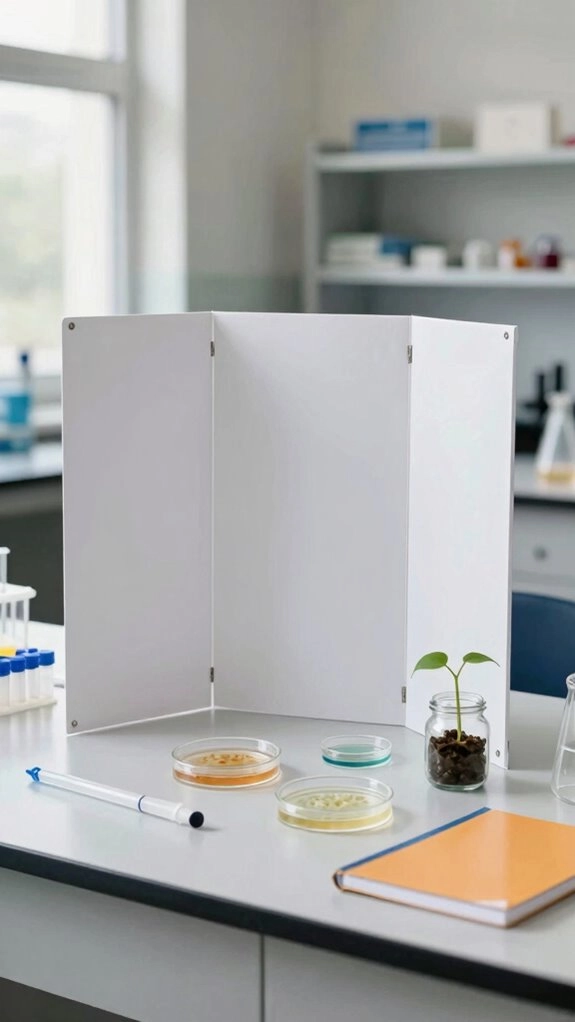
Presentation matters because it helps others understand your science project quickly. When judges can follow your question, method, results, and conclusion, they see the care you’ve put into your work.
Use scientific order: Title, Question, Hypothesis, Materials, Procedure, Data, Conclusion, and Sources. Strong Data accuracy means recording three trials for each condition and showing averages.
Careful unit formatting, such as °C or mL, keeps measurements clear. Add captioned photos of your setup and testing.
For hypothesis testing, state exact numbers in your conclusion. Explain whether results support or refute your idea.
You’ll help everyone feel confident discussing your finding. Use process diagrams and clear visuals to help viewers understand how your experiment works.
Choosing a Visual Style for Your Project
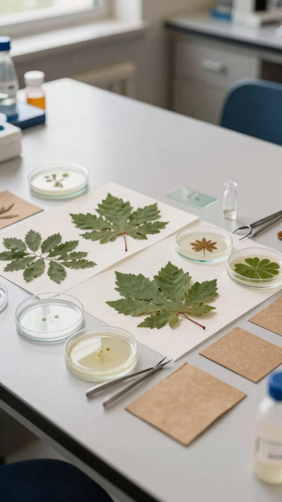
How can one visual style make your science project feel organized and memorable? Choose one theme, such as minimal, pop-art, or nature illustration. Carry it across your poster, notebook, graphs, and labels.
Your project will look like it belongs with the best displays in class. Use two fonts at most, with a large title and readable body text.
Follow a simple grid: Title, Question, Hypothesis, Method, Results, Conclusion.
Add Icon style section markers, consistent logo placement, reusable diagram frames, and sticker like data labels.
Keep graphs clear with labeled axes, units, high-contrast marks, and a simple legend for everyone.
For projects involving experiments, use scientist-style thinking to make your observations, results, and conclusions feel clear and purposeful.
Color Palettes That Work for Science Projects
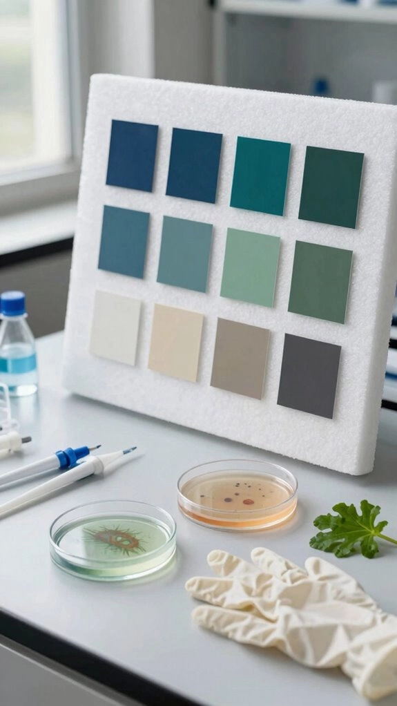
A smart color palette can make your science project look clear and professional.
Choose three or four colors, such as navy, white, teal, and gray, to create a look classmates follow.
Keep backgrounds light, then save bright accents for titles and key findings.
Color psychology can support theme compatibility: use cool blues and greens for water studies or earth tones for plant growth.
Build contrast accessibility with dark text on white or pale yellow.
Give colors meaning, too.
Blue can show an independent variable, while green shows a dependent variable.
This consistent labeling helps everyone understand your results quickly.
Use anti-glare screen protectors when presenting digital results to reduce reflections and keep charts easy to read.
Organizing Text, Diagrams, and Images
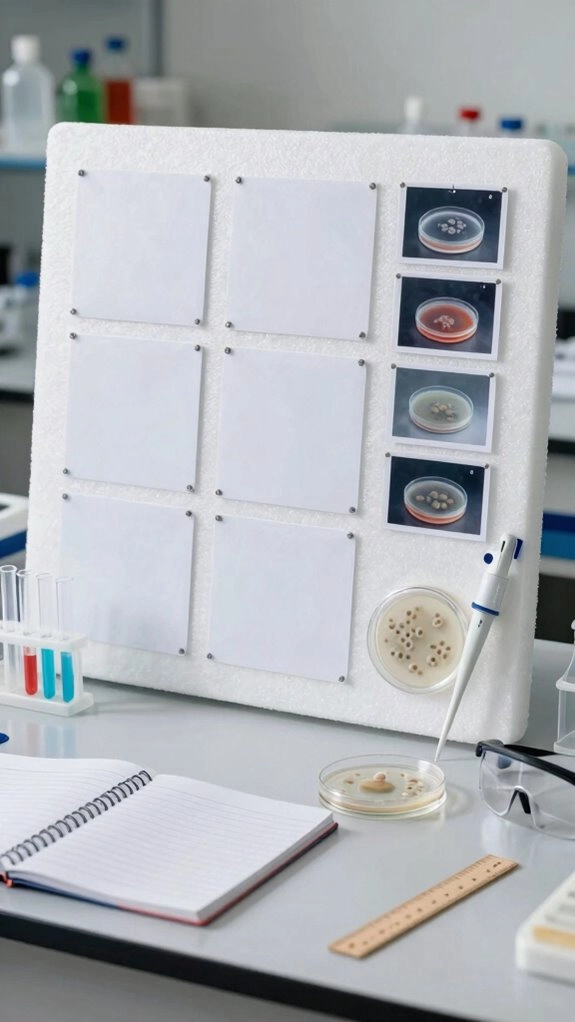
With a clear layout, your project board can guide viewers through your experiment. Put the title at the top, then place your question and hypothesis on one side.
Use numbered boxes for method steps, tables and graphs for results, and your conclusion at the bottom.
Layout templates help your work feel familiar and easy to follow.
Strengthen Data visualization with even graph scales, time moving left to right, and units on every axis.
Keep captions consistency and figure labeling clear with short notes.
Add arrows to important changes.
Use one font, bold headings, dark text, and matching image widths.
Use concept maps to show how your question, variables, results, and conclusion connect.
Minimal Science Project Designs
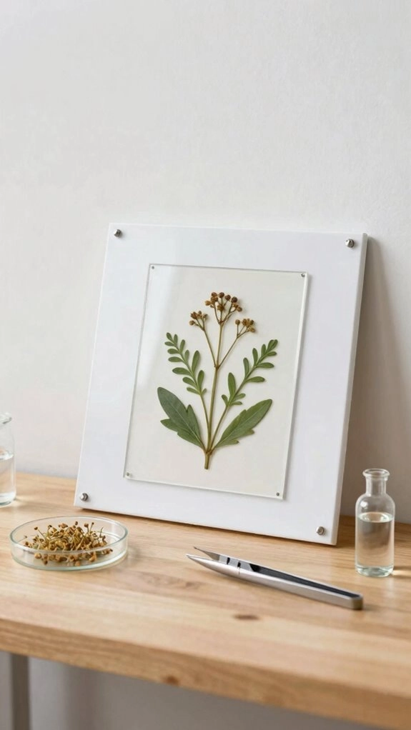
Once your layout is organized, a minimal design can make your project shine. Use a white poster, black labels, and bold title font so your work feels calm and clear.
Ask one question, write one hypothesis, then list:
- what you changed
- what you measured
- what you kept the same
Add a small graph or one table for data quality and testable predictions.
- ✓ same container size
- ✓ same starting temperature
- ✓ same measurement time
Finish with a conclusion: sample A was 4.2 cm farther, and you’d improve it by repeating 5 trials soon.
Use active recall by explaining your graph and conclusion out loud in your own words before presenting.
Creative Ideas for Biology Projects
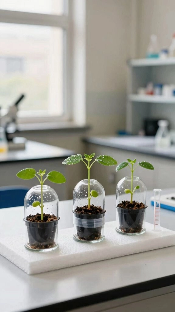
How can you make a biology project feel exciting and smart?
You can test plant growth under light and darkness or compare watering levels while keeping control variables the same.
Try hypothesis crafting before you start, then track height in millimeters every few days.
Use data visualization to show growth rates in a way that’s easy to see.
For a microbiology idea, swab a phone or doorknob and count colonies with careful measurement accuracy.
You can also delve into egg projects by observing floating height in salt water.
These choices help you stand out and feel part of the science crowd with pride in every class.
Creative Ideas for Chemistry Projects
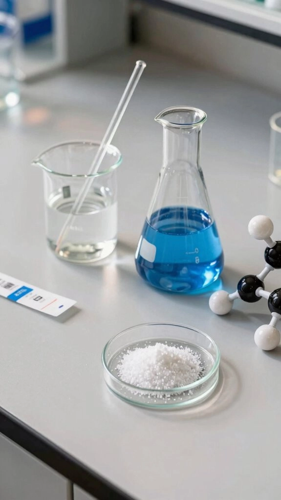
If you want your chemistry project to look cool and feel smart, try crystal growing. Use the same container each day and watch sugar crystals change.
- Measuring Crystal size shows how concentration, temperature, and stirring time matter.
- Color Contrast helps your poster pop with simple labels and clear photos.
- Try a pH Strip to compare mild vinegar mixes and note Reaction Timing.
Then you can track mass loss from salt water or chalk samples. Share your chart with friends, and you’ll show that chemistry can feel clear, fun, and welcoming for everyone in your class too, at science club.
Creative Ideas for Physics Projects
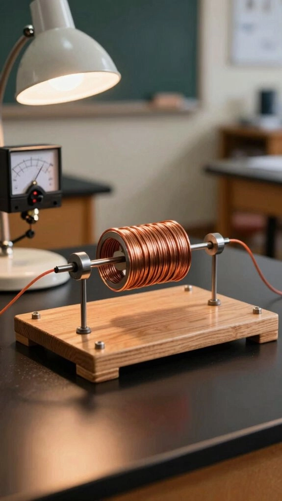
After you’ve made chemistry charts look neat, physics can feel as exciting.
You can build paper-airplane racks, test pendulums, compare friction, or launch a DIY catapult.
Keep one controls variable control at a time so your results stay fair.
Use the same height, angle, or release point, then record distances or times many times.
You can also check air pressure with a sealed ball setup under adult supervision.
Add labels, graphs, and measurement uncertainty analysis so your work feels smart and clear.
These projects help you belong in science, not just watch from the side with friends who care.
Making a Science Project Look Organized Without Overdecorating
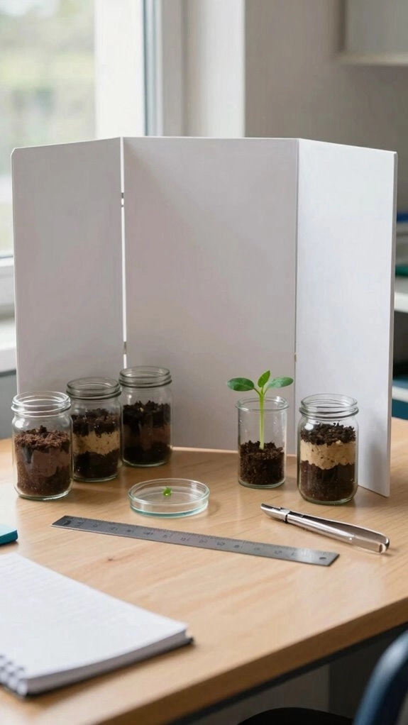
With a clean layout, your science project can look sharp without feeling crowded. Use a 3-column poster layout, so viewers find your Question/Goal, Method/Data, and Conclusion fast.
Keep clear chart labeling and consistent captioning on every figure.
Add a data table with units, and use one font size for headers and another for values.
Pick one accent color, then keep black or gray text and blue charts.
You’ll feel proud sharing posters that look neat and strong.
- Short text blocks help your ideas breathe.
- Numbered steps keep your method easy to follow.
- Minimal background details let your results shine.